Research
The medical bill was already $4 trillion before anyone got the surprise invoice
Insurance did not buy peace of mind
A GoodRx survey of insured adults, fielded from May through July 2026, found that coverage is not the same as protection. About one in four respondents said they needed care their plan did not cover. Fifty-six percent worried about affording a serious illness or accident. Among those already under financial strain, 52 percent delayed or skipped dental care, and 31 percent put off prescriptions. Premiums were up for 34 percent of the sample; deductibles were up for 26 percent.
That is a bill people feel in the examining room. It is not, however, a number the federal statistical system publishes as “surprise invoices.” What the books do show is how large American health consumption already is, what it is made of, and how uneven it is across the map. Those figures come from the Bureau of Economic Analysis’s personal consumption expenditures by state, the same family of accounts that measure groceries and gasoline.
The distinction matters. BEA’s health line is household consumption of health goods and services, regardless of who writes the check — private insurance, Medicare, Medicaid, or the patient. It is not an out-of-pocket tally, and it is not a claim that every household faces a $12,000 invoice. It is the size of the health economy as lived in American spending. If the survey is asking whether insurance still feels like insurance, the accounts are asking how big the underlying bill has become.
Household health consumption has grown into a $4.1 trillion line

View exact chart values
| year | health_billions | total_pce_billions | health_share_pct |
|---|---|---|---|
| 1997 | 919.9 | 5536.8 | 16.61 |
| 1998 | 979.7 | 5877.2 | 16.67 |
| 1999 | 1033.3 | 6283.8 | 16.44 |
| 2000 | 1109.6 | 6767.2 | 16.4 |
| 2001 | 1209.4 | 7073.8 | 17.1 |
| 2002 | 1317.1 | 7348.9 | 17.92 |
| 2003 | 1410.7 | 7740.7 | 18.22 |
| 2004 | 1514.9 | 8232 | 18.4 |
| 2005 | 1612.3 | 8769.1 | 18.39 |
| 2006 | 1715 | 9277.2 | 18.49 |
| 2007 | 1823.2 | 9746.6 | 18.71 |
| 2008 | 1909.3 | 10050.1 | 19 |
| 2009 | 1999.3 | 9891.2 | 20.21 |
| 2010 | 2078.1 | 10260.3 | 20.25 |
| 2011 | 2153.2 | 10698.9 | 20.13 |
| 2012 | 2230.7 | 11047.4 | 20.19 |
| 2013 | 2285.2 | 11388.2 | 20.07 |
| 2014 | 2395.1 | 11874.5 | 20.17 |
| 2015 | 2536.3 | 12297.4 | 20.62 |
| 2016 | 2652.1 | 12726.8 | 20.84 |
| 2017 | 2745.5 | 13290.6 | 20.66 |
| 2018 | 2867 | 13934.4 | 20.58 |
| 2019 | 3028.3 | 14437.5 | 20.97 |
| 2020 | 2944.5 | 14231.4 | 20.69 |
| 2021 | 3254.9 | 16119.7 | 20.19 |
| 2022 | 3479.9 | 17690 | 19.67 |
| 2023 | 3785.3 | 18833.1 | 20.1 |
| 2024 | 4088.3 | 19896 | 20.55 |
A $4.1 trillion line, and a fifth of everything households buy
In 2024, household consumption of health goods and services reached $4,088.3 billion in current dollars, up from $919.9 billion in 1997 — 4.4 times as large, unadjusted for inflation. Total personal consumption expenditures were $19,896 billion. Health’s share of that total rose from 16.6 percent to 20.5 percent. The climb was not a straight line. The share jumped in the 2008–09 recession, when other spending fell, eased a little after the pandemic rebound, and was back above one-fifth by 2024.
On a per-person basis the narrower “health-care services” series — outpatient care plus hospitals and nursing homes, excluding drugs and insurance — was $9,747 in 2024, up from $2,901 in 1997. That is 16.7 percent of per capita consumer spending ($58,499) and 13.3 percent of 2024 per capita personal income ($73,227). Put differently, the typical American’s measured consumption of doctors, hospitals and nursing homes is now more than twice grocery spending for home use ($4,350) and about 7.5 times spending on gasoline and other energy goods ($1,295).
Those gasoline figures are the 2024 annual average, before this week’s return of $100 oil. Even so, they make the survey’s anxiety less mysterious. A household can fear a hospital deductible and still, in a normal year, spend far more on care than it spends at the pump.
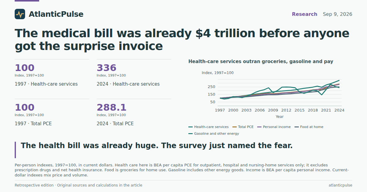
Health-care services outran groceries, gasoline and pay

View exact chart values
| year | health_index | total_pce_index | food_index | gas_index | income_index |
|---|---|---|---|---|---|
| 1997 | 100 | 100 | 100 | 100 | 100 |
| 1998 | 104 | 104.9 | 101.5 | 88.6 | 106 |
| 1999 | 106.7 | 110.9 | 106.1 | 96.9 | 110.3 |
| 2000 | 112.2 | 118.1 | 110.1 | 120.7 | 117.8 |
| 2001 | 120.5 | 122.2 | 113.7 | 115.3 | 121.7 |
| 2002 | 129.8 | 125.8 | 114.8 | 107.7 | 122.7 |
| 2003 | 137.1 | 131.4 | 118.7 | 124.9 | 126 |
| 2004 | 145.8 | 138.4 | 124.1 | 146.7 | 131.9 |
| 2005 | 154.1 | 146.1 | 129.9 | 177.1 | 137.6 |
| 2006 | 160.8 | 153.1 | 134.8 | 197.6 | 146 |
| 2007 | 169.1 | 159.3 | 140.6 | 211.6 | 152.7 |
| 2008 | 176.3 | 162.7 | 145.3 | 237.3 | 157.6 |
| 2009 | 183.5 | 158.8 | 144.7 | 172.7 | 151.6 |
| 2010 | 189.3 | 163.3 | 146.1 | 200.7 | 156.4 |
| 2011 | 194.2 | 168.9 | 150.9 | 244.8 | 164.5 |
| 2012 | 199.7 | 173.1 | 154.6 | 247.6 | 170.6 |
| 2013 | 202.8 | 177.1 | 157.9 | 245.6 | 171.3 |
| 2014 | 210.1 | 183.1 | 163.8 | 237.5 | 178.5 |
| 2015 | 220.6 | 188.2 | 168.1 | 182.8 | 185.4 |
| 2016 | 230.1 | 193.2 | 171.7 | 163.3 | 188.9 |
| 2017 | 237 | 200.4 | 177.7 | 183 | 196.7 |
| 2018 | 246 | 208.9 | 182.6 | 205.9 | 205.6 |
| 2019 | 258.1 | 215.3 | 188.4 | 196.9 | 214.3 |
| 2020 | 244.7 | 211.3 | 208.2 | 143.7 | 228.2 |
| 2021 | 274.3 | 239 | 223.4 | 214.4 | 249.5 |
| 2022 | 290.9 | 260.8 | 239.7 | 284.3 | 255.7 |
| 2023 | 313.2 | 275.3 | 245.3 | 254.6 | 270.1 |
| 2024 | 336 | 288.1 | 249.9 | 238.9 | 282.5 |
Care outran pay. Groceries and gasoline did not keep up either, but care won.
Index the same per-person series to 1997 and the ranking is blunt. Health-care services stand at 336 in 2024. Total consumer spending is at 288. Per capita personal income is at 283. Food at home is at 250. Gasoline and other energy goods are at 239. These are current-dollar indexes, so they mix price and volume; they are not a pure inflation measure. They are still a fair description of which bills grew fastest on the official ledger.
The gasoline line is the jumpiest, as anyone who has watched a pump knows. It spiked with oil in the 2000s, collapsed in 2009 and 2020, and surged again in 2022. Health-care services barely paused, except in 2020, when people deferred care and the index actually fell. Then it resumed the climb. Income grew, but not as fast as the care line.
None of that proves the GoodRx respondents are right to skip the dentist. It does show why a medical bill can feel like a different species of expense. Groceries are frequent and visible. Gasoline is on a sign at the corner. Hospital and physician consumption is large, lumpy, and often mediated by an insurer whose explanation of benefits arrives after the fact.
Hospitals take the largest slice. Dental is the smallest named one.
Split the 2024 health-function total and hospitals dominate: $1,493.6 billion, 36.5 percent. Physician services are $793.3 billion, 19.4 percent. Prescription drugs are $669.0 billion, 16.4 percent. Nursing homes are $248.7 billion, 6.1 percent. Dental services — the care the survey respondents were most likely to delay — are $185.7 billion, 4.5 percent. The remaining $698.0 billion, 17.1 percent, is other health goods and services: paramedical care, medical products besides drugs, and leftover categories.
Those components add back to the $4.09 trillion health-function total. They do not include net health insurance, which BEA records under financial services. That line was $270.1 billion in 2024. It is a service charge — premiums minus benefits — not the premium a worker sees deducted from a paycheck, and not the deductible that produces the feared invoice. Adding it to the health function would be mixing two different concepts. Leaving it out means the accounts understate the cash households send to insurers.
The composition also clarifies the survey. People delay dental care because dental is often weakly covered; it is a small slice of the national health total precisely because so much of American medicine is hospital- and physician-centric, where the dollars (and the surprise bills) concentrate. Drugs are the other pressure point the survey named, and at $669 billion they are no rounding error.
Hospitals are the largest slice of the health bill

View exact chart values
| category | billions | share_of_health_pct |
|---|---|---|
| Hospitals | 1493.6 | 36.5 |
| Physician services | 793.3 | 19.4 |
| Other health goods and services | 698 | 17.1 |
| Prescription drugs | 669 | 16.4 |
| Nursing homes | 248.7 | 6.1 |
| Dental services | 185.7 | 4.5 |
New England spends like a different country from the Southwest
The per-person care line is not uniform. In 2024, BEA’s New England region consumed $11,272 per person in health-care services. The Mideast was $11,058. The Far West was $10,586. Then a step down: Plains $10,017, Great Lakes $9,980. The Southeast was $9,053, below the U.S. average of $9,747. Rocky Mountain was $8,425. The Southwest was $8,077 — $1,670 below the national figure.
A selected group of states makes the same point more sharply, without pretending to be a 50-state ranking. New York was $12,221 per person. Massachusetts was $11,985. California was $11,054. New Jersey was $10,468. Illinois was $9,895. Florida was $9,545. Arizona was $8,556. Mississippi was $8,135. Texas was $7,807. Utah was $7,233. The New York figure is about 69 percent higher than Utah’s.
That is not a morality play about which states are healthier. Younger populations, different prices, different mixes of Medicare and private coverage, and different volumes of hospital care all sit inside the same per-person number. It is a map of how large the care line already is where people live.
New England spends the most per person on care; the Southwest the least

View exact chart values
| region | pc_health_services | vs_us |
|---|---|---|
| Southwest | 8077 | -1670 |
| Rocky Mountain | 8425 | -1322 |
| Southeast | 9053 | -694 |
| Great Lakes | 9980 | 233 |
| Plains | 10017 | 270 |
| Far West | 10586 | 839 |
| Mideast | 11058 | 1311 |
| New England | 11272 | 1525 |
Income is not a full explanation
Plot a handful of those states by income and care, and the picture is not a clean diagonal. Massachusetts pairs the highest income in the sample ($93,575 per person) with nearly the highest care ($11,985). Mississippi pairs the lowest income ($51,948) with middling-to-low care ($8,135) — and the highest care-to-income ratio in the sample, 15.7 percent. Utah is relatively young and relatively cheap on this measure: $7,233 in care against $67,345 in income, 10.7 percent. Texas is 11.2 percent. New York is 14.4 percent even with high incomes.
These ratios use the narrower health-care services series, so they exclude drugs. They are descriptive. They do not say Mississippi’s residents are overcharged, or that Utah has found a secret. They do say that a poorer state can devote a larger share of income to hospitals and doctors than a richer, younger one, which is one reason a national survey about medical bills will not land the same way in every ZIP code.
The accounts stop in 2024. The survey is from 2026. Premiums, deductibles and drug list prices have not stood still. What the books can tell a reader, without pretending to score the survey, is that the fear of a major medical bill is arriving in an economy where health consumption is already one dollar in five of everything households buy, hospitals take more than a third of that, and the care line has been outrunning pay for a generation.
Poorer states can still devote a larger share of income to care

View exact chart values
| state | pc_income | pc_health_services | health_share_of_income_pct |
|---|---|---|---|
| New York | 84978 | 12221 | 14.4 |
| Massachusetts | 93575 | 11985 | 12.8 |
| California | 86378 | 11054 | 12.8 |
| New Jersey | 84844 | 10468 | 12.3 |
| Florida | 73340 | 9545 | 13 |
| Mississippi | 51948 | 8135 | 15.7 |
| Texas | 69762 | 7807 | 11.2 |
| Utah | 67345 | 7233 | 10.7 |
Sources and methods
This is retrospective enrichment using pinned catalogue snapshots, not a reconstruction of what was knowable on the edition date of 9 September 2026. Later revisions may be present.
Research was assembled on 11 September 2026 against the pinned BEA SAPCE snapshot created 31 August 2026 (release bea-sapce-2025-09-26) and the BEA annual state income snapshot created 31 August 2026 (release bea-regional-state-annual-2026-04-09).
Observation periods used: calendar years 1997–2024 for PCE; 2024 for state and regional comparisons and for the income ratios in the text. The income extract includes a 2025 observation that was not used for 2024 claims.
BEA household health consumption (PCE by function, “Health”) is spending on health goods and services regardless of payer. It is not out-of-pocket spending, not insurance premiums, and not a household average bill.
The per capita “health care” series is outpatient services plus hospital and nursing-home services. It excludes prescription drugs and net health insurance. Indexes are current-dollar (1997=100) and therefore mix price and volume.
Net health insurance is the BEA service charge (premiums minus benefits), recorded under financial services, not in the Health function. It is not a measure of employee premium contributions or deductibles.
State figures are a selected sample, not a complete ranking. Regional figures use BEA regions. Missing values were not treated as zero. No causal effects are inferred from descriptive comparisons.
The GoodRx/YouGov survey is original reporting in the 9 September 2026 basket (1,887 insured adults, May–July 2026) and is cited as survey evidence, not as BEA data.
Research completed 2026-09-11, for the September 9, 2026 news edition. This is retrospective analysis, not a reconstruction of information available that day.